RED BULL TV CASE STUDY
︎
︎
How might we help Red Bull sports fans find events and connect with their favorite athletes?
Red Bull TV provides access to exclusive video content centered around adventure, outdoor sports, music events and stories featuring some of the best athletes in the world. They sponsor Redbull Athletes across many different
![]()
I. Background
Red Bull TV provides access to exclusive video content centered around adventure, outdoor sports, music events and stories featuring some of the best athletes in the world. They sponsor Redbull Athletes across many different

THE CHALLENGE
“As a RedBull Sports fan, I want an easy and quick way to access events & content that interest me and connect with my favorite athletes.”

MY APPROACH
Interviews
Think-aloud testing
Abstract Laddering
Competitive Analysis
Persona
User Journey
Insights & Recommendations

RESULTS
Sitemap
User Flow
Wireframe sketches
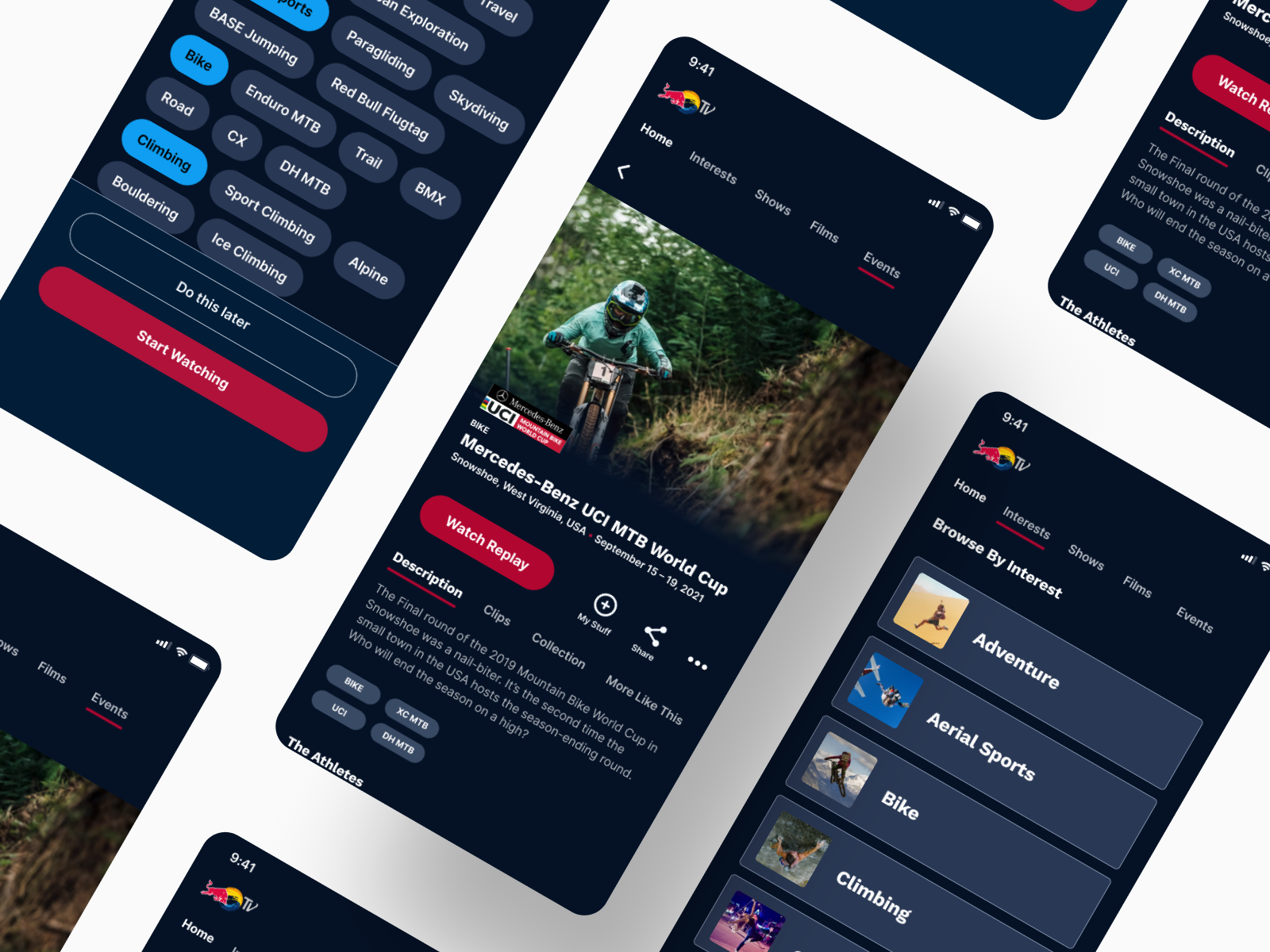
High-Fidelity Prototype
The Problem
Despite the tester’s enthusiasm with Redbull TV’s content, I found that testers struggled to find events and content tailored to their interest, struggled to interpret taxonomy on the site’s navigation, to find information where they expected it to be, and most importantly, I observed them experiencing navigational difficulties that appeared to have an impact on their ability to make the most out of the website’s capabilities.
For more detailed information on my Research process, please check out my full UXR Report.
The Solution
This solution helps users tailor what they want to see, improve findability of content/events, and give users an easy way to access athlete profiles.


II. UX Research
I began my research by interviewing and Think-Aloud Testing the current state of the app with 5 participants that stream extreme sports. I wanted to see how easy it was for them to find relevant content on the app, and how they reacted to discovering new content.
Overall the Red Bull TV website was received well by participants. They described Red bull TV as containing high quality, unique and interesting content not available in other free streaming content sites.
All participants interviewed stated that they would continue to use the Red bull TV website to watch sports related content.

I chose an Empathy Map to organize the info I collected from interviews and desk research. This method was easy way to reveal patterns, insights & pain points that can help me get to know and empathize with the users.
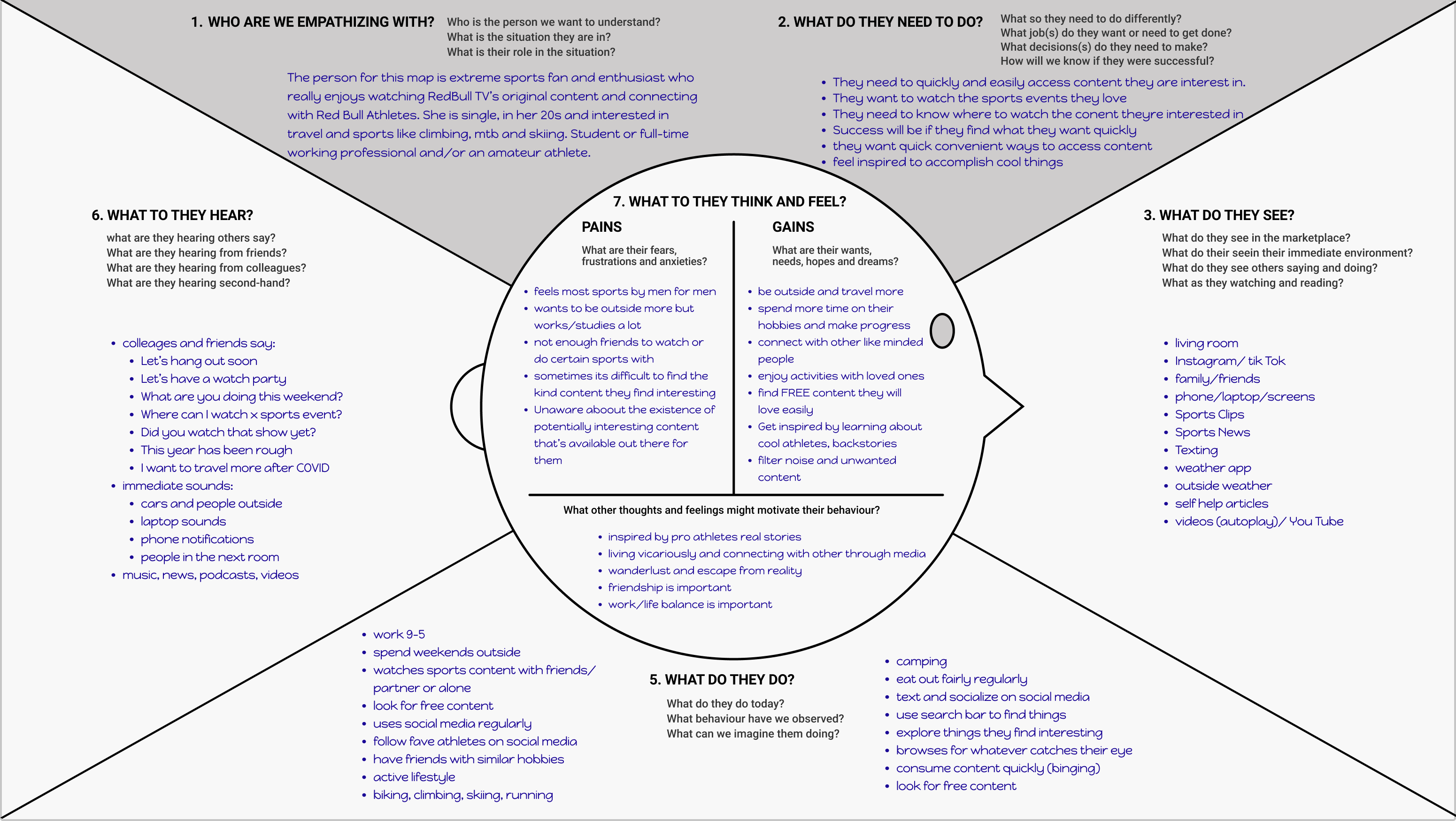
Empathy Map Takeaways:
- Feeling connected is important
- Work 9-5 but want to spend their weekends outside
-
I created a Persona because I needed to empathize more with a specific type of user and prepare to start designing with the in mind.

Evie Sloan uses Redbull TV to watch specific events such as women’s mountain biking and has a few favorite athletes she enjoys following. Her main goals are to easily find and discover current cycling events they’re interested in and get to know their favorite athletes and stories. She ends up having to sort through a lot of different content and click on a few links before she finds what she would like to see.
The Journey Map below is an example of what Evie’s journey might look like when she wants to find and event replay on Redbull TV.

I found a lot of opportunities so it was important to narrow down which opportunites I would like to focus on before I begin designing.
III. Ideation
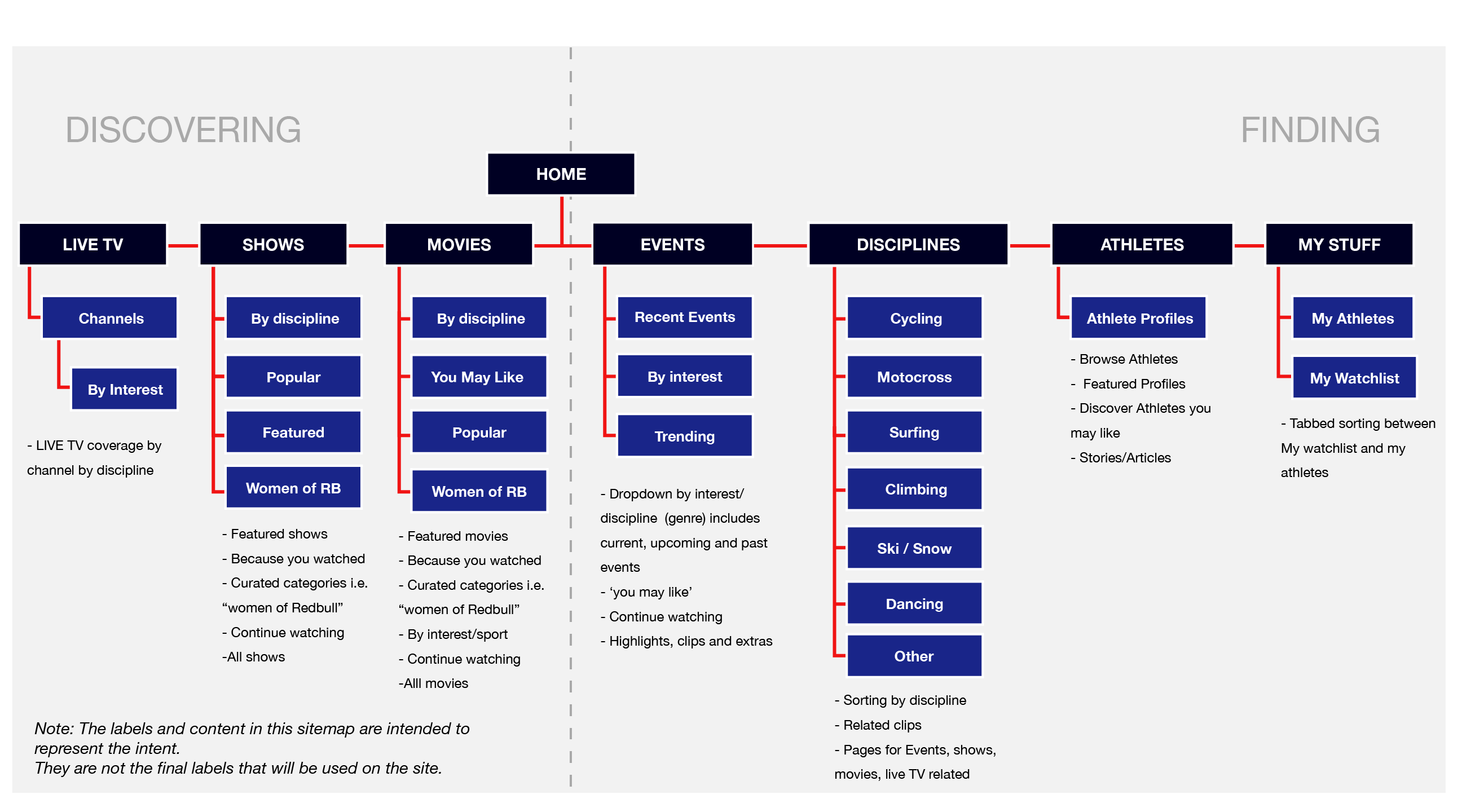
I began designing by creating a high-level version of a sitemap forcuse on two main themes for different user attitudes:
- Search: The user wants to find something specific. User’s attitude is more purposeful.
- Discovery: The user wants to browse for new interesting content. User’s attitude is more leisurely.
Next, I wanted to visualize what Evie’s user flow could look like:
In this case, Evie is a new user who wants to find a replay of a live cycling event.
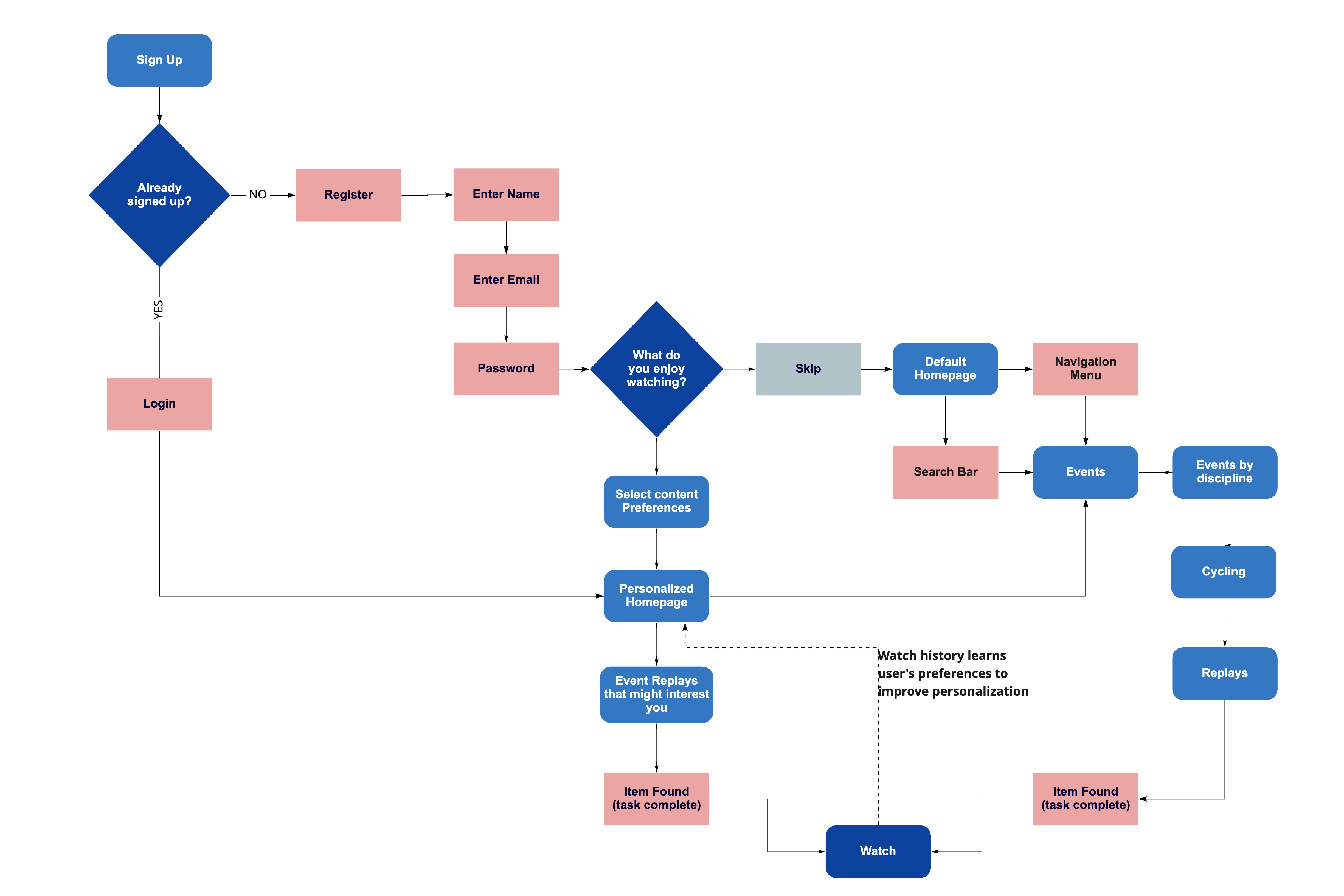 User Flow Takeaways:
 - Early sign-up will help us ensure that Evie gets access to useful tools like personalization, favoriting and continuity across devices.
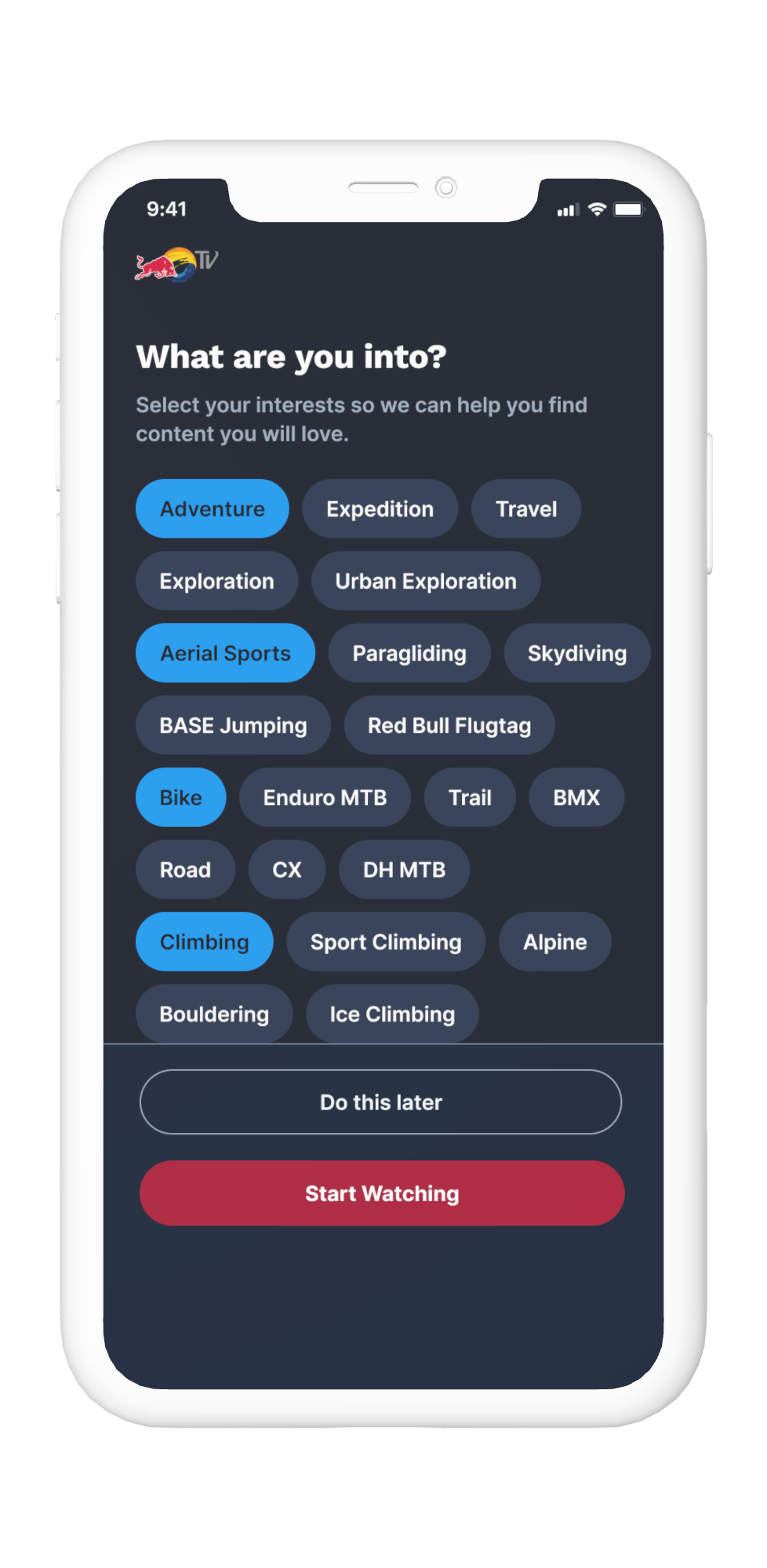
- Onboarding quiz will help us show Evie more relevant content first & will prevent them from feeling overwhelmed.
- Organizing events by interest/discipline will help them find events they want to watch quickly and easily.
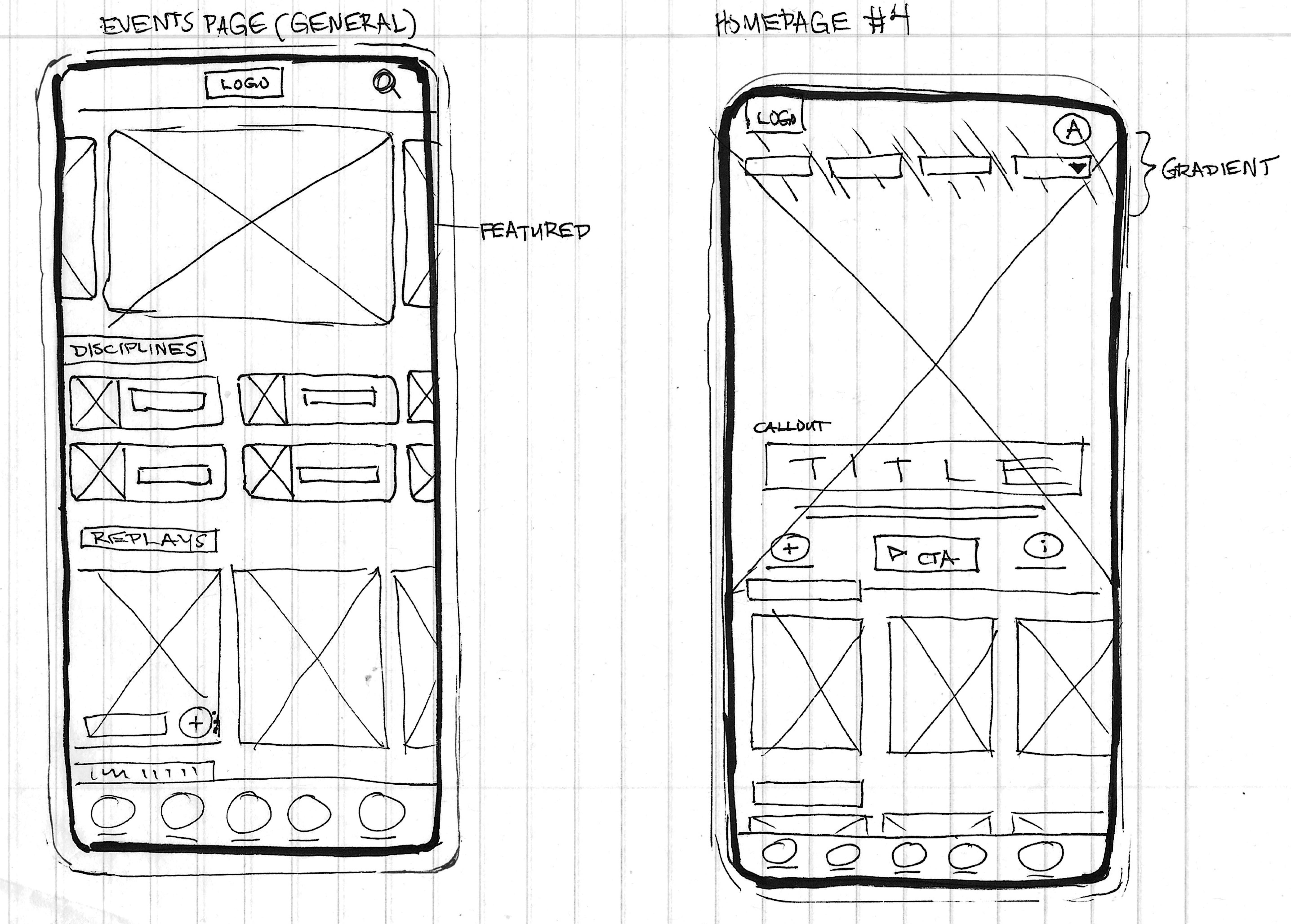
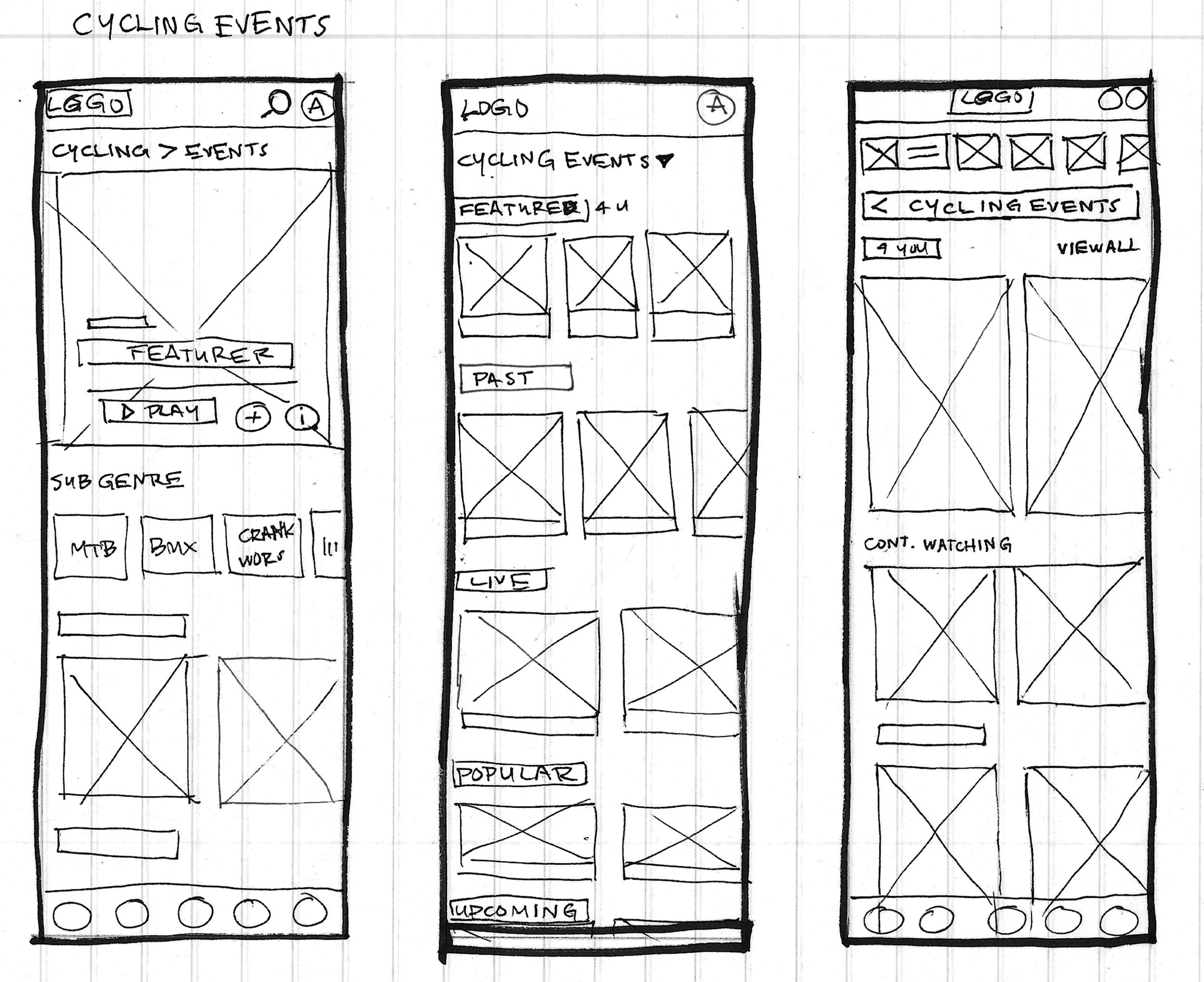
IV. Prototype Sketches
I wanted to create at least three different concepts for each key new screen in the user flow.




Pattern Library
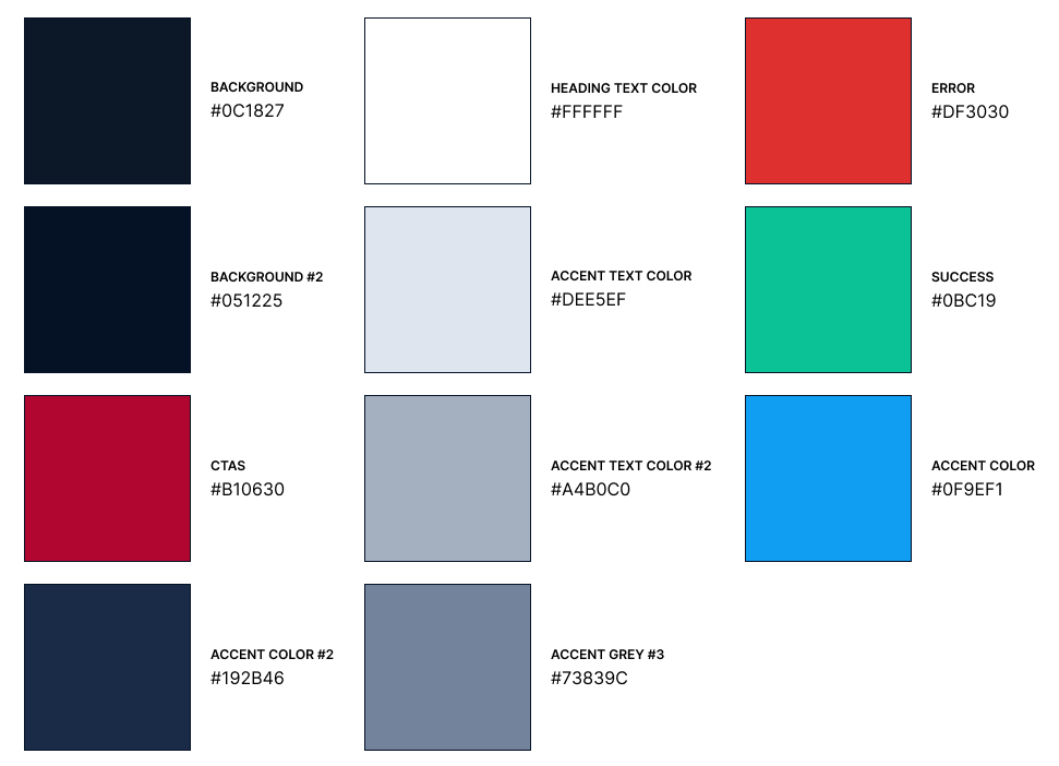
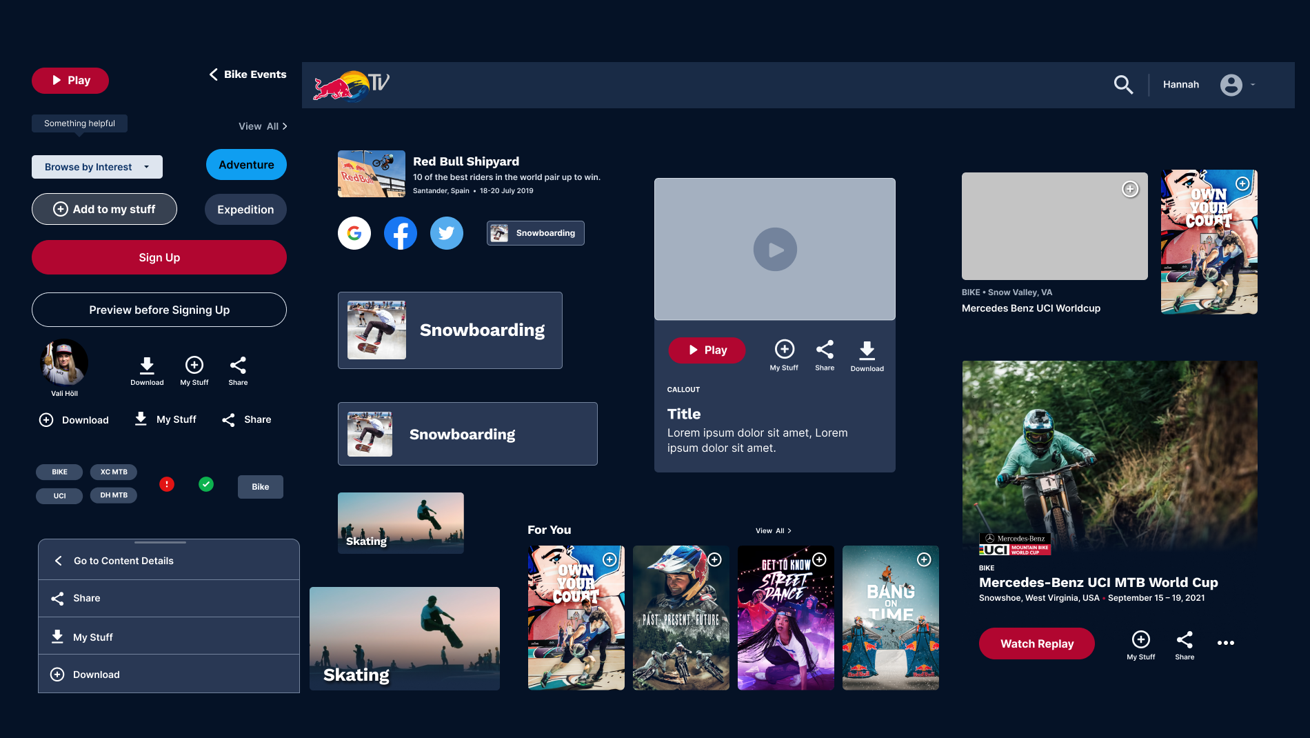
As a bonus phase, I designed a Pattern Library and components to mimic Redbull’s current UI. One of the challenges I faced was making sure that the colors met accesibility standards using a dark background and red CTAs throughout. I used a Figma plugin to help me make sure that the color combinations are ok.
![]()
![]()
![]()
As a bonus phase, I designed a Pattern Library and components to mimic Redbull’s current UI. One of the challenges I faced was making sure that the colors met accesibility standards using a dark background and red CTAs throughout. I used a Figma plugin to help me make sure that the color combinations are ok.

V. Next Steps
1. test my final protoype and gather more insights so I can continue iterating my design.
JAMBA JUICE CASE STUDY
︎
How might we help a group easily purchase through Jamba Juice’s mobile app?
Click here for our Jamba Juice process book and product showcase
AS A BONUS WE WORKED ON A FAUX PROMO VIDEO TO SHOWCASE OUR APP’S FEATURES:
︎
How might we help a group easily purchase through Jamba Juice’s mobile app?
Click here for our Jamba Juice process book and product showcase
AS A BONUS WE WORKED ON A FAUX PROMO VIDEO TO SHOWCASE OUR APP’S FEATURES:
HEADSPACE CASE STUDY
︎
How might we help people build a new meditation habit before asking them to sign up for Headspace?
Click here for my Headspace Deck
PROCESS BOOK & PRODUCT DEMO:
DOLLAR SHAVE CLUB CASE STUDY
︎
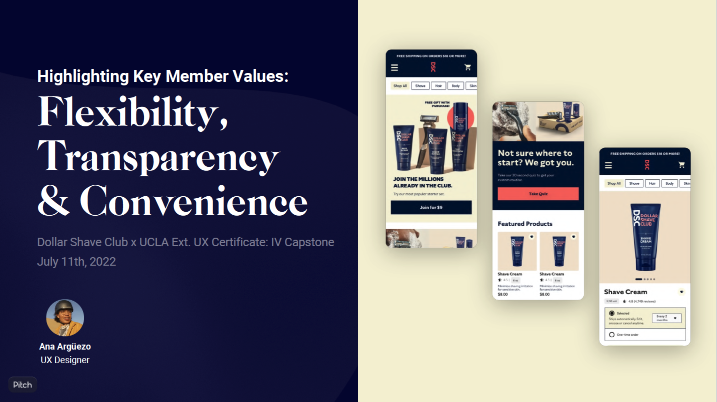
How might we prioritize content to highlight Dollar Shave Club’s commitment to their members of convenience, flexibility & transparency?
Click here for my Dollar Shave Club Sprint Deck
SUPRMARKT CONTENT STRATEGY CASE STUDY
︎
How might we help deliver fresh food to communities who need it the most?
A content strategy solution for SÜPRMARKT Homepage and a new FAQ page. SÜPRMARKT is a low cost organic grocery servicing low income communities in LA. It operates weekly, providing 100% organic produce to make great health and healing available to the communities which need it most.
Click here for my Suprmrkt Content Strategy Deck
